Captions that light one word at a time
Every text template in the library was a title: it arrives, it sits, it goes. A caption is the other thing text does over video — it carries the speech, and it says which word is being said right now. There were none.
A caption is not a title with a shorter fade
The library had three hundred and fifteen graphics and not one of them captioned anything. That is a strange shape for a library aimed at vertical video, where most of what is watched is watched silent at first and the words on screen are the delivery rather than the decoration.
The obvious way to build one is a layer per word, keyframed to light in turn. It is also the way that breaks the moment anybody uses it. A caption is a sentence somebody types, and typing a different sentence is the first thing a person does with one — four fixed word-layers do not survive that.
So the animation reads the words instead. Caption highlight is a text effect like Letter pop or Typewriter: it splits whatever the layer says into words and walks a light across them. Change the line, change its length, change the two colours, and it still works, because nothing about it was ever tied to the words that shipped.
Six of them, on the Shorts shelf: a plain line, a line on a glass plate, heavy uppercase, a two-line version whose second line waits its turn, one with a speaker chip above it, and one with a bar running under the words in step with the light.
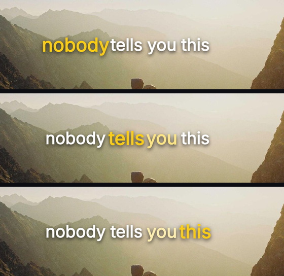
The window starts before the first word
The first version of the effect lit the first word before the caption had said anything. Not a rendering fault — an arithmetic one, and the kind that only shows itself once the thing is built.
An effect's progress is clamped between nothing and everything, so a caption sitting quietly before its turn reports a progress of zero. A window centred on word one is fully open at zero. The word was lit the whole time it was waiting.
On five of the six templates it merely looked like a stray highlight. On the two-line caption it was unmistakable: the second line was meant to wait a beat and a half and take over, and instead both lines showed a lit word from the first frame. Two places to follow, which is exactly one more than a caption may ever have.
The travel now runs in words rather than in progress, and it starts one word before the first and ends one word after the last. Off either end of the run, nothing is lit. And the arithmetic lives in one function that both the screen and the exporter call, rather than in two copies that agree until one of them is edited.
Reactions, of which there were also none
Hearts drifting up the side of the frame, a burst on the thing that just happened, a row of counters ticking over. The library covered the ask — subscribe, like, bell — thoroughly, and the response not at all.
Five of them: Floating Hearts, Heart Burst, Reaction Bar, Likes Rising and Star Rating. Every shape in them is drawn as a path rather than typed as an emoji, which matters more than it sounds. An emoji is a glyph out of whatever colour font the machine happens to carry, and the exporter does not run where the browser does — a graphic whose entire content is an emoji can come out of the render empty.
Drawing them as paths bought something else. An icon loaded as an image file is a picture in a box, so a shadow on it draws a rectangle: over a bright frame the heart arrived sitting on a grey card. A path takes a real drop shadow in both renderers, and its colour is a property rather than a filename — turning a heart from red to a channel colour is one field in the panel, not a different template.

Two colours, and now you pick them
Caption highlight works between a resting colour and an accent. So do Colour sweep and Colour pulse. All three had the same gap: the two colours were chosen when the effect was applied and nothing in the editor reached them afterwards. For a caption, where the two colours are the entire design, that is not much of a template.
The Animate panel now shows both beside the effect once it is on a layer. Changing either patches the effect rather than re-applying it, which sounds like a detail and is not — re-applying would drag the animation back to the playhead, so picking a colour would move it.
Sizing took a correction too. The captions fit their type to the column the platform leaves alone, and the first version was handed a whole sentence and answered with forty-three pixels. That is a subtitle. They ship as short spoken blocks now, at sixty-three to seventy-one pixels, which is what a caption is on a phone held at arm's length.
Everything is on the Shorts shelf, and every layer, word, colour and keyframe in them is yours like any other template.