How to make a lower third that reads
A lower third is the oldest graphic in television and the easiest one to get wrong, because everything about it is a judgement of degree: how low, how long, how much. Get any of the three wrong and it reads as homemade even when the design is good.
How low is a lower third
The name says the lower third of the frame, and the name is a broadcast convention rather than a measurement. In practice the readable band is narrower than that: below about 70% of the frame height and above the strip the player controls take.
The templates on the lower third shelf sit between roughly 77% and 82% down the frame. That is not an accident of design — it is the band that stays clear of the controls when a viewer touches the screen and still reads as belonging to the bottom of the picture rather than floating in the middle of it.
Flush to the bottom edge is the common mistake. It looks tidy in the editor, where nothing is drawn over your video, and it is the first thing covered the moment somebody moves the mouse.
How long it holds
Long enough to read twice. That is the rule that survives every argument about timing: somebody glancing up halfway through should still be able to read the whole thing.
For a name and a title, that is around four to six seconds on screen, not counting the animation in and out. A lower third that enters over half a second, holds for five, and leaves over half a second is six seconds of video and feels brief rather than rushed.
The exception is a lower third that repeats. If the same person speaks four times, the first appearance can hold longer and the later ones can be shorter, because by then the viewer is being reminded rather than told.
How much it should say
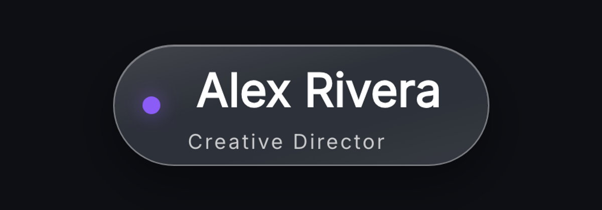
A name and one line under it. That is the whole form. The line is a role, a company, a location, or what this person is about to explain — one of those, not several joined by a comma.
Two lines of small type under a name is the most common overload, and it is the one that costs the most: the eye reads the name, starts the second line, gives up, and returns to the video having absorbed neither.
Handles are a special case. If the point of the graphic is that somebody can go and find this person, the handle is the second line and the role is cut. You are choosing what the viewer should do with the information, and you only get to choose once.
The three mistakes
Too small. A lower third is read at arm's length on a phone, not at a desk. If the name is not comfortably readable when the video is a third of the screen, it is too small — and the fix is usually to cut the second line rather than to shrink the type further.
Too busy behind it. A plate, a rule, a slab or a fold exists to separate the type from whatever is moving underneath. Type straight onto footage reads until the footage gets light, and then it does not. Frosted Name Plate and Editorial Slab solve this in two different ways; Hairline Rule is for footage you know is dark.
Left on too long. A lower third that holds for fifteen seconds stops being information and becomes furniture, and the viewer stops seeing it. If the person is still talking, the graphic has already done its job.
Make a lower third in the browser

Questions
- Where exactly should a lower third sit?
- Between roughly 70% and 85% down the frame — low enough to read as a lower third, high enough to stay clear of the player controls that appear along the bottom whenever a viewer taps or moves the mouse.
- How long should a lower third stay on screen?
- Long enough to read twice, which for a name and one line is about four to six seconds of hold, plus the animation in and out.
- What should a lower third say?
- A name and one line. A role, a company, a location or a handle — one of them. Two lines of supporting type is the most common way to make a lower third unreadable.
- Do I need a background plate behind the text?
- Unless you know the footage behind it is consistently dark. A plate, slab or rule keeps the type readable when the shot changes brightness, which it will.
- What size should I build a lower third at?
- The resolution you edit at — 1920×1080 for most channels. It is drawn as shapes and type rather than photographed, so it scales to 4K without softening.