Graphics for Shorts: the column you actually have
Vertical is not landscape turned on its side. The platform draws its own buttons, caption and channel name over your video in fixed places, and the space left over is a narrow column — about two thirds of the frame. Everything that has to be read belongs inside it.
What the platform takes
On a 1080×1920 Short, the edges are not yours. Roughly the bottom 470 pixels carry the caption, the channel name and the sound attribution. The right-hand 200 pixels carry the like, comment, share and remix buttons stacked vertically. The top 220 pixels carry the status bar and the platform's own controls.
That leaves a column about 790 pixels wide and 1230 tall, offset to the left of centre. It is a genuinely different composition from a landscape frame, not the same graphic rotated — and a bar designed to read across 1920 pixels of width has nowhere to go in 790.
These numbers move. Platforms redesign their interfaces and the safe area moves with them, usually by growing. Building tight against the edge of what is currently clear is building against a line that is going to move inwards.
Which way a vertical graphic should grow
Downwards from the top of the column, or outwards from its centre. Not upwards from the bottom, which is where every landscape instinct sends it — the bottom of a vertical frame is the busiest part of the screen and the part most likely to change.
A hook card near the top of the column is read first and is the safest place on the frame. A subscribe prompt sits comfortably in the middle third. Captions belong low but above the caption band, which is why the caption templates in this library sit at about 1260 pixels down rather than at the bottom.
Shorts Hook Card, Countdown Hook and Bold Statement are all built to sit in the upper half for this reason. Shorts Caption Bar and the caption pack sit low, inside the column, above the platform's own text.
Type is bigger than you think
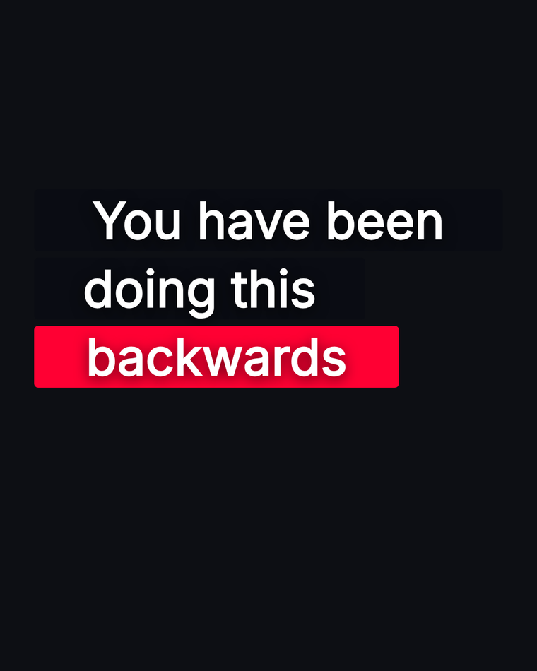
A Short is watched at arm's length on a phone, often with the sound off and often while scrolling. The type that reads comfortably on a 27-inch monitor is small on a phone held at a normal distance, and the difference is larger than it looks in the editor.
The practical test: shrink the preview to about the size of a phone on your desk and read it from where you are sitting. If you have to lean in, it is too small. Most vertical graphics want type at least half again as large as the equivalent landscape graphic.
This is also why a vertical graphic says less. One line, or two short ones. The column is narrow, the type is large, and those two facts multiply.
Building it and getting it out
Start from a vertical canvas rather than resizing a landscape one. The canvas presets cover 1080×1920 for Shorts and Reels, and a template built for that shape already respects the column.
Export with transparency if the graphic sits over your footage — ProRes 4444 for desktop editors, WebM for the web, a PNG sequence if you need per-frame alpha. If your editor is CapCut or a phone app, a green-screen MP4 is the route that works, because those apps cannot read alpha video.
Turn the safe zone overlay on while you position it. It draws the column for vertical compositions directly over the canvas, which is considerably faster than exporting, uploading, and discovering that the like button is sitting on your call to action.
Questions
- What is the safe area for YouTube Shorts?
- On a 1080×1920 frame, keep roughly 90 pixels clear on the left, 200 on the right for the action buttons, 220 at the top, and 470 at the bottom for the caption and channel name. That leaves a column about 790 by 1230, offset left of centre.
- What size should a Shorts graphic be?
- 1080×1920, the same as the video. Build at that shape rather than resizing a landscape graphic — a bar that reads across a wide frame has nowhere to go in a narrow one.
- Where should text go on a Short?
- Inside the clear column, and higher than instinct suggests. The top half is the safest place; the bottom is where the caption, channel name and sound attribution sit, and it is the part most likely to change when the platform is redesigned.
- Can I use the same graphic on TikTok and Reels?
- The frame is the same 1080×1920 and the furniture is similar, so a graphic built for the Shorts column usually survives all three. The exact bands differ, which is another reason not to build tight against the edge.
- Why does my Shorts overlay look blurry?
- Usually because it was built at landscape resolution and scaled up to fill a vertical frame. Build at 1080×1920 from the start; a graphic drawn as shapes and type scales cleanly, a stretched one does not.